TL;DR | BOOSTING LEAD CONVERSIONS AT PHILIPS WITH SMARTER FORMS
As a Product Designer at Philips, I led the end-to-end design of a scalable lead onboarding initiative - aligning with business growth and compliance requirements, and setting UX standards for lead qualification across markets.
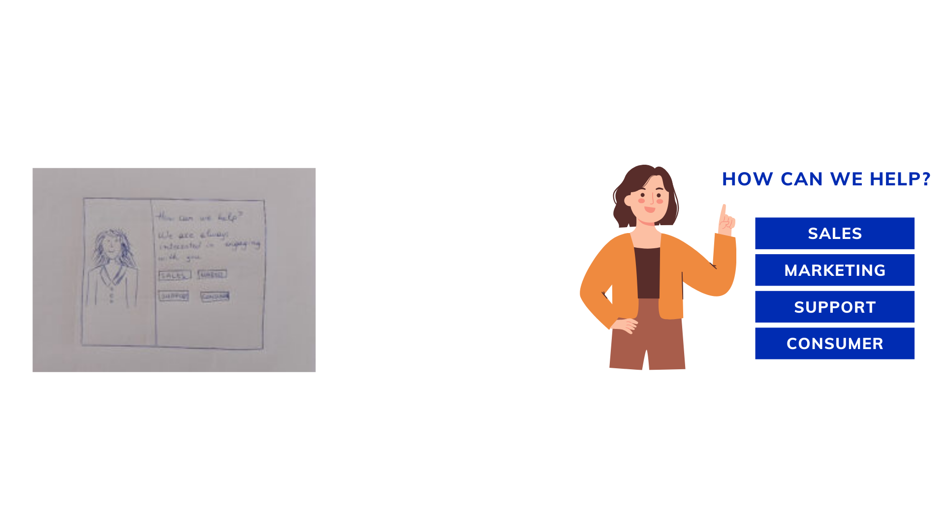
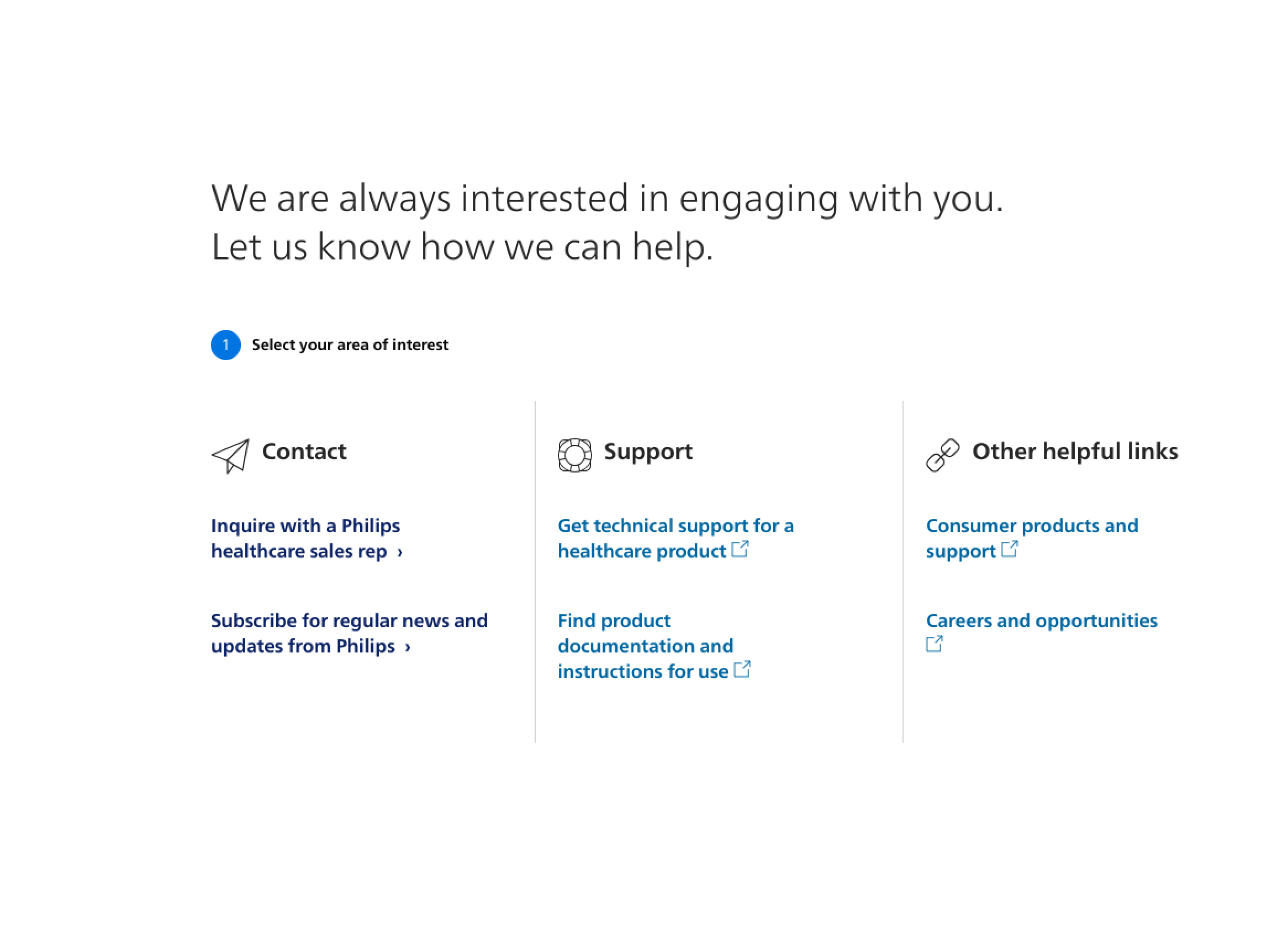
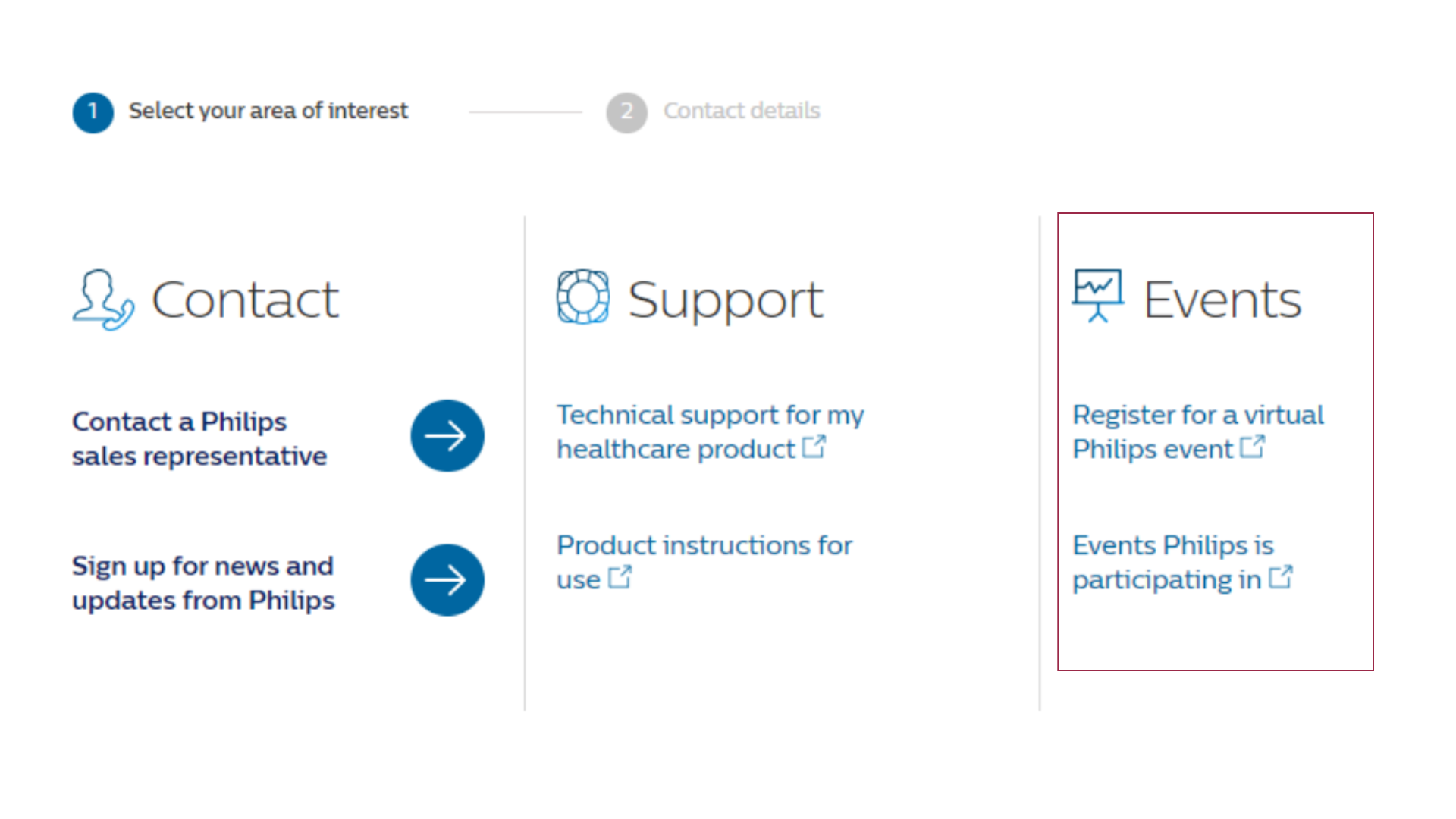
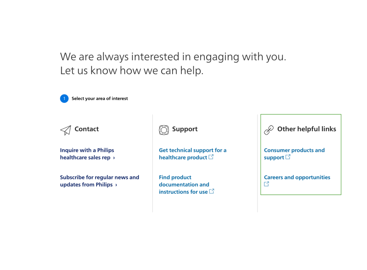
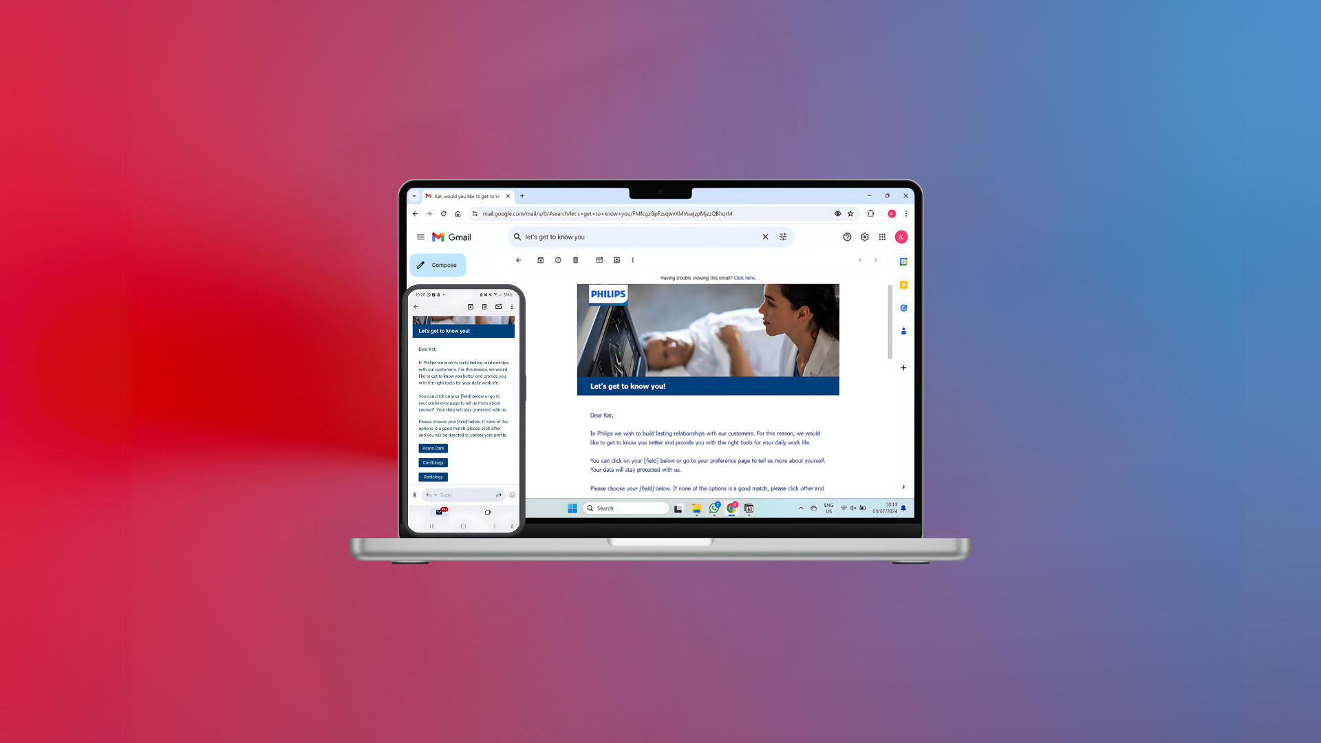
SOLUTION SNEAK PEEK
I redesigned the full experience — from rethinking what users see first to how the form fields are ordered, labeled, and shown. The goal was to make users feel supported, not overwhelmed.
KEY DESIGN DECISIONS
MAKE IT FEEL PERSONAL
I added a goal-setting step at the start. It lets users pick what they came for, so they don’t see generic forms.
DON'T DRAIN USERS
Healthcare professionals are busy and tired. I reduced the number of fields and cleaned up the interface to lower the cognitive load.
MAKE IT QUICK
Simple privacy language, clearer actions, and fewer clicks. We saw users complete the form more often and with fewer mistakes.
RESEARCH APPROACH | MIXED-METHOD
To guide decisions, I used both qualitative and quantitative inputs. I couldn’t run interviews or tests due to COVID, so I combined web data with a competitive benchmark study.
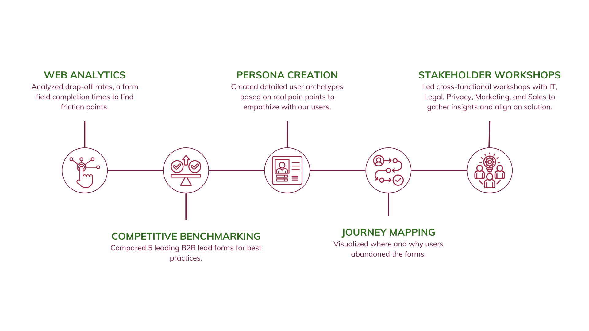
RESEARCH FINDINGS | WEB ANALYTICS & COMPETITIVE BENCHMARKING
Lengthy & standardized forms was the industry practice but our users gave us wrong information or dropped off.
Our forms were long and looked like every other company’s, but users were dropping off or submitting incomplete data. Looking at other industry examples gave me a sense of what to avoid and what to try.

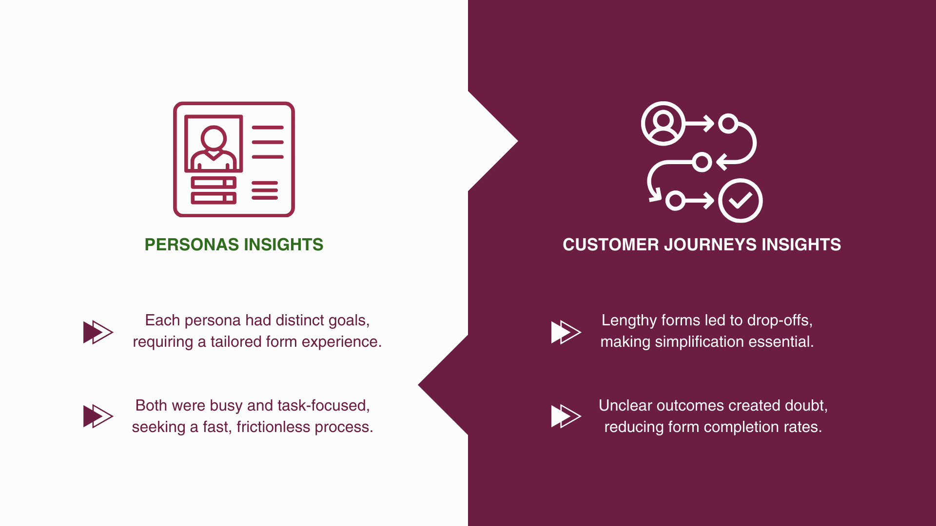
DEFINE | PERSONAS & CUSTOMER DECISION JOURNEYS INSIGHTS
The journey maps and personas helped us understand where users got stuck or confused. That shaped our redesign goals — especially what to remove.
IDEATION WORKSHOPS | BRAINWRITING & SKETCHES
I led ideation workshops with key stakeholders from IT, Marketing, Sales and Markets to involve them to the project and work together for the solution.
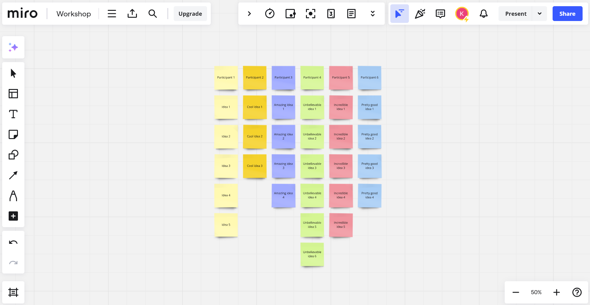
To get ideas, I ran a brainwriting session. It worked well in a remote setting and gave space for both introverts and extroverts.
We voted and focused on the strongest concept: a form experience centered on user goals.
A goal-centric widget which offers different options based on our users' needs.
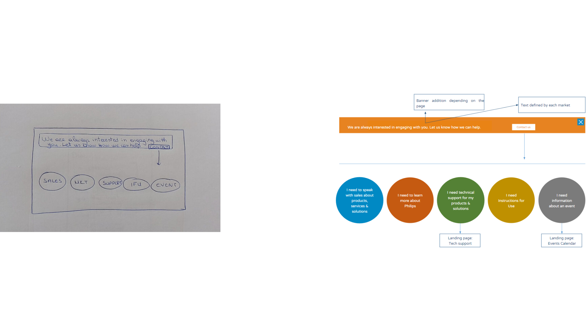
We felt we should have an extra page that would act as another barrier for users to make errors.
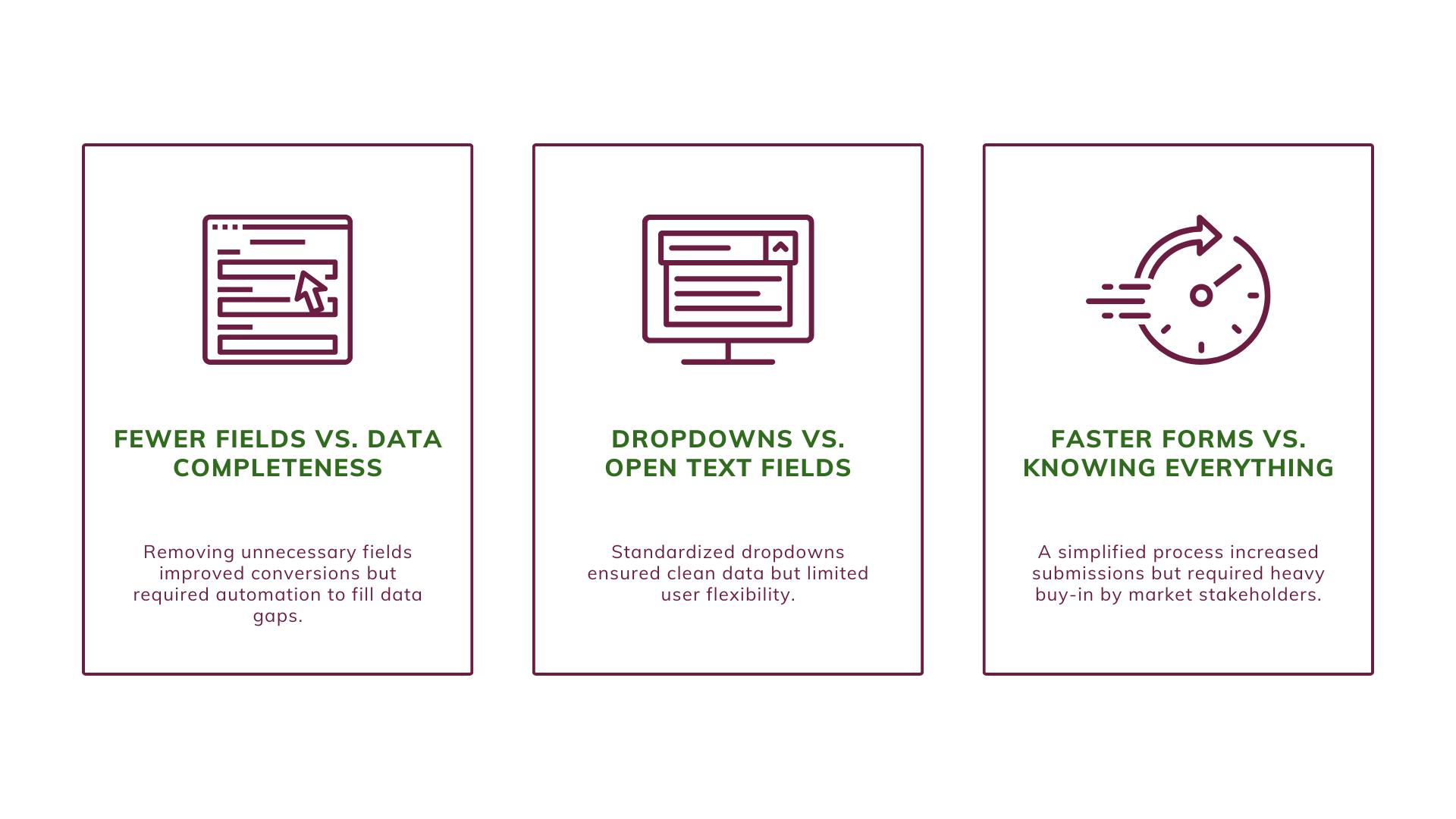
TRADE-OFFS | BALANCING USABILITY & BUSINESS IMPACT
The main challenge was balancing user ease with data quality for the sales team. We wanted fewer fields — but still enough info to create real opportunities. That meant every field had to earn its place.
PROTOTYPE | FIRST MVP
I built a working prototype and started validating our ideas right away.
PROTOTYPE | A/B TESTING
We ran an A/B test in Australia, the UK, and the US.
The results spoke for themselves:
-82%
Errors
+25%
Form submission
+18%
Data quality
PROTOTYPE | USABILITY TESTING
Users called out unnecessary items & confusing CTAs.
We tested with real users. They told us what didn’t make sense, what felt like a chore, and where the form still needed improvement.
PROTOTYPE | ITERATION
Based on the testing, I iterated our solution.
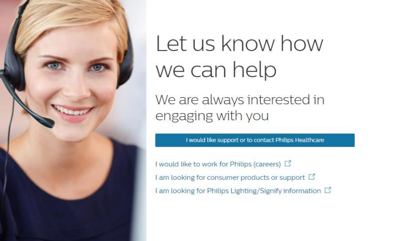
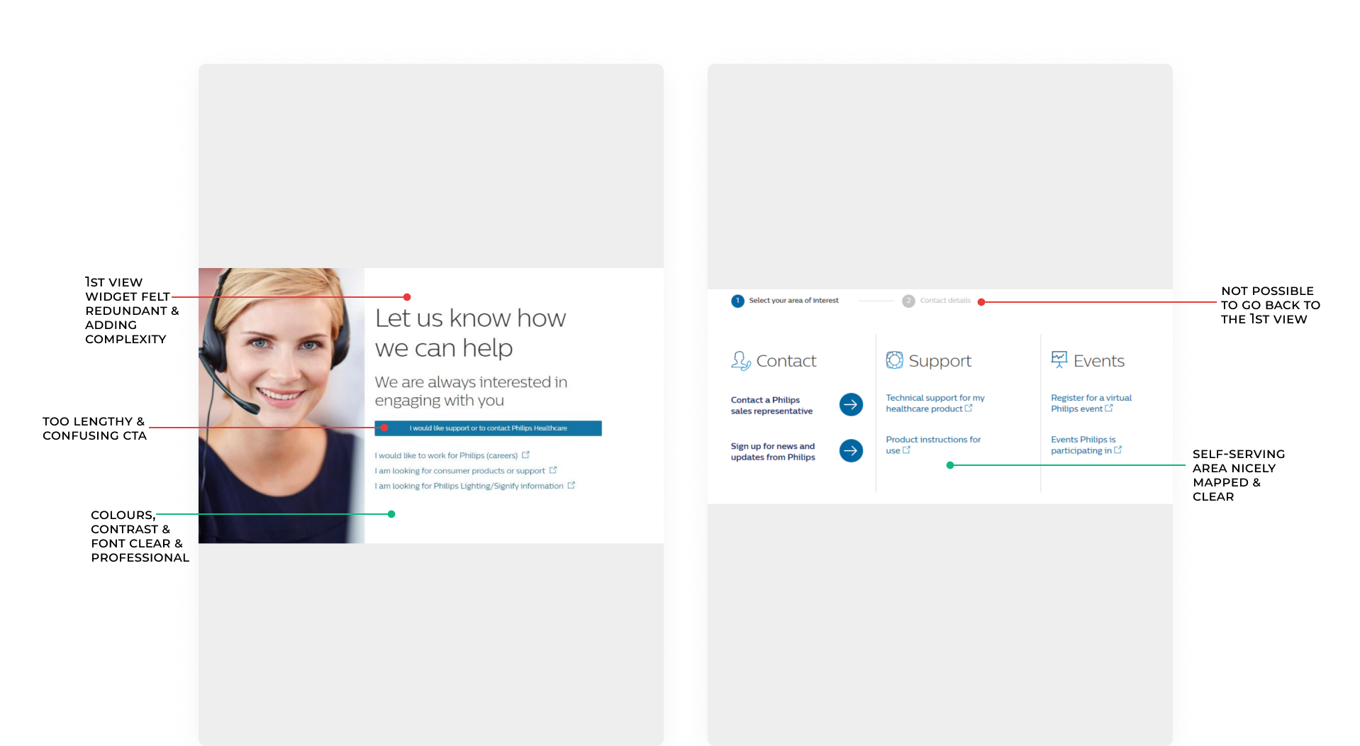
Before: The first view of the widget was deemed unnecessary by users.
After: This became the widget's first view.
Before: We saw very low interaction with these items, thus we decided to replace them.
After: The new items were high interaction items from the previous first view of the widget that we had disregarded.
FINAL PRODUCT | SCREENS
Here’s the final experience — clear, relevant, and simple. It supports different user goals without overloading anyone.
FINAL PRODUCT | RESULTS
After launching globally, I tracked results closely. We saw improvements across all key areas:
-80%
Errors
+20%
Lead quality
+30%
MQL-to-Opportunity rate
+45%
User Engagement
RETROSPECTION | NEXT STEPS
This project came to an end, but these are some areas that I'd explore.
PHASE 1: FORM LENGTH
Even though we had reduced the number of fields, there was still room for improvement. By furthering discussions on internal requirements, I'd push for more changes in terms of the form fields.
PHASE 2: DROP-DOWN FIELDS
Conduct user testing on function/specialty dropdown menus to improve accuracy, as the existing options were not tested with users and worked only within Philips.
PHASE 3: AUTOMATE PERSONALIZATION
Use back-end mapping to auto-fill fields based on previous user interactions, in order to ask as few questions as possible in the forms.
RETROSPECTION | LEARNINGS
As challenging as this project was, it brought some crucial learnings.
CO-CREATIVE SESSIONS CAN MITIGATE A LOT OF RISKS
By involving colleagues from different teams with different user perspectives, it is possible to create a good and all-rounded solution. However, at the very least - still test the prototype.
OWN YOUR BIASES
No matter how hard we try, we are humans and we all have biases. This project tested a lot of my colleagues' and my preconceptions. I learned to call out not only others' biases, but most importantly, my own.
Selected Works
Fly High, Not Hard: Designing a User-First Flight Booking App ExperienceProduct Design | Research | Wireframes | Prototype
Email Alchemy: Turning Missing Contacts into Golden Opportunities for PhilipsProduct Design | Customer Journeys | Wireframes | Testing

Museum CX Overhaul: Crafting a Visitor Journey That's a MasterpieceService Design | Research | Personas | Customer Journeys
KS
Let's create together
Phone: +31628750362
Email: kath.stavrou@gmail.com
LinkedIn: @kathstavrou
© Katharina Stavrou