TL;DR | SIMPLIFYING FLIGHT BOOKING WITH TRANSPARENT PRICING
As a Product Designer, I tackled hidden fees and complex checkouts in a personal project to improve trust and ease of booking.
SOLUTION SNEAK PEEK
Designed the flight booking experience with progressive disclosure, default bias for economy preselection, and familiar mental models for intuitive use.
KEY DESIGN DECISIONS
PROGRESSIVE DISCLOSURE
Used progressive disclosure to minimize cognitive load, showing only essential information at each step and improving user focus.
DEFAULT BIAS
Preselected the economy class based on user testing, where price was key, increasing simplicity and conversion rates.
FAMILIARITY BIAS
Aligned the design with existing mental models, enhancing usability through familiarity and intuitive navigation.
RESEARCH APPROACH | MIXED-METHOD
To ensure that my design decisions were data-driven and user-centric, I followed a structured research process that combined qualitative and quantitative insights.
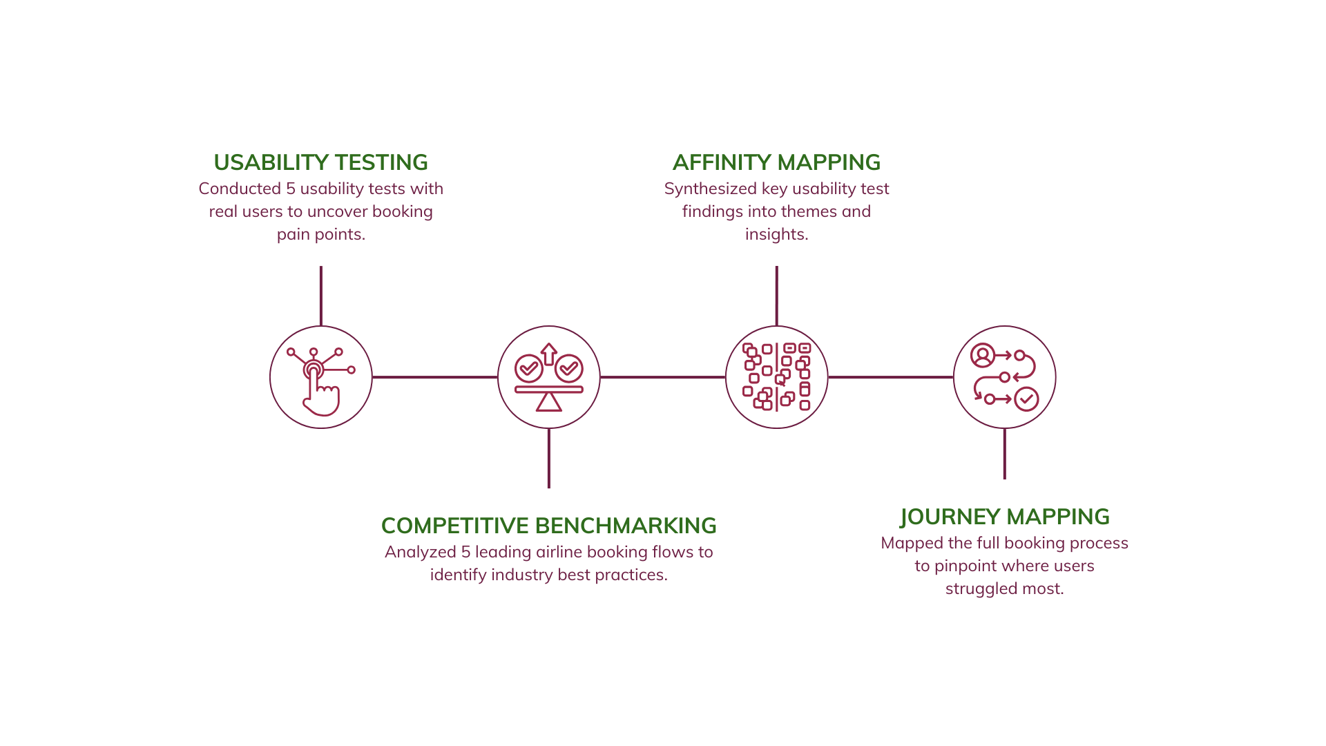
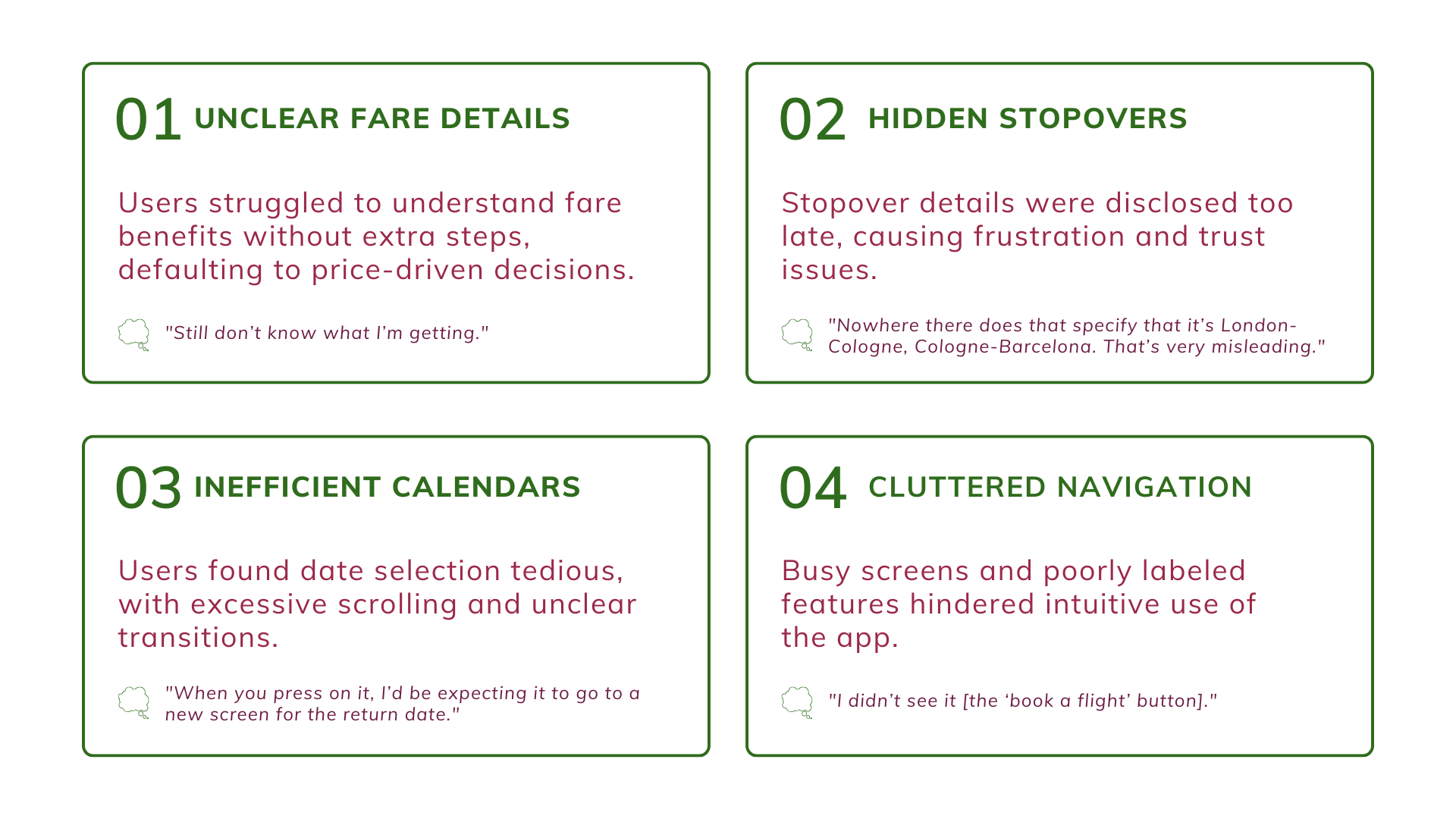
RESEARCH | USABILITY TESTING
By conducting and analyzing five usability tests, I pinpointed issues with fare details, stopover visibility, and calendar functionality for refinement.
DEFINE | CUSTOMER DECISION JOURNEY
Our users were unsatisfied during the biggest part of their experience, but especially while selecting their flights.
IDEATE | FLOW DIAGRAM
Before starting ideating through sketching, I wanted to understand the flow and which screens needed to be designed.
IDEATE | SKETCHES
Sketched all necessary screens - getting there though needed me to sketch all my not so good ideas too.
HOME SCREEN WIDGET
Sketched a few different versions of the homescreen widget, but there could be only one winner. Chose the one that looked visually the best and easiest to use.
Take a look of the sketches (and why I didn't choose most of them) by clicking on the full screen button on the top right!
FLIGHT & FARE SELECTION
Sketched some versions, but as I said before, there could be only one winner. The one I selected looked visually the best, was the easiest to use and included everything in one screen.
Take a look of the sketches (and why I didn't choose most of them) by clicking on the full screen button on the top right!
FINAL SKETCHES
The final sketches are here to stay - take a look to see them all by on the full screen button on the top right!
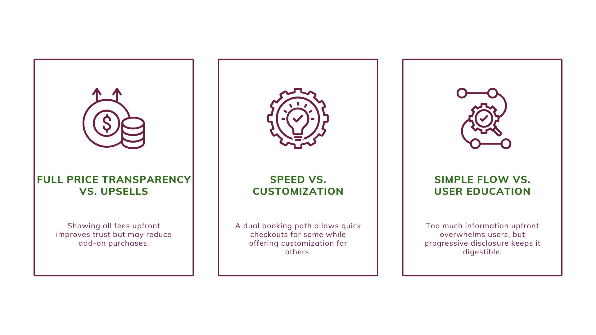
TRADE-OFFS | BALANCING USABILITY & BUSINESS IMPACT
Designing a seamless booking experience meant balancing user trust with airline revenue priorities.
PROTOTYPE | HI-FI WIREFRAMES
Enhanced the flight booking experience with cognitive biases and progressive disclosure.
In designing the flight booking wireframes, we applied progressive disclosure to ease cognitive load, utilized default bias by preselecting economy class to boost conversions, and leveraged familiarity bias by aligning the interface with users’ mental models for a more intuitive experience.
FIRST ITERATION | RESULTS
After conducting ten usability tests, I received the following results.
-50%
Errors
+30%
NPS
-20%
Time spent
RETROSPECTION | NEXT STEPS
First iteration is over - what's next?
PHASE 1: LAZY LOADING
Implement lazy loading to reduce load times and leverage the Doherty Effect, enhancing user engagement with instant feedback during flight searches.
PHASE 2: ENDOWMENT EFFECT
Apply the Endowment Effect, i.e. allowing users to save preferences, creating a sense of ownership and encouraging repeat bookings with familiar choices.
RETROSPECTION | LEARNINGS
Users tend to bring quite some interesting insights about human behavior.
PEOPLE LIE (OK, NOT ON PURPOSE)
Users may say they dislike certain aspects of the experience, but once they interact with it, they often have no issues, revealing a gap between stated preferences and actual behavior.
MONEY, MONEY, MONEY
Price consistently proves to be the most important factor in their actual flight booking decisions. Comfort or conveniece still score much lower.
Selected Works
Philips Lead Capture Makeover: From Okay to MarvelousProduct Design | Facilitation | Customer Journeys | Wireframes
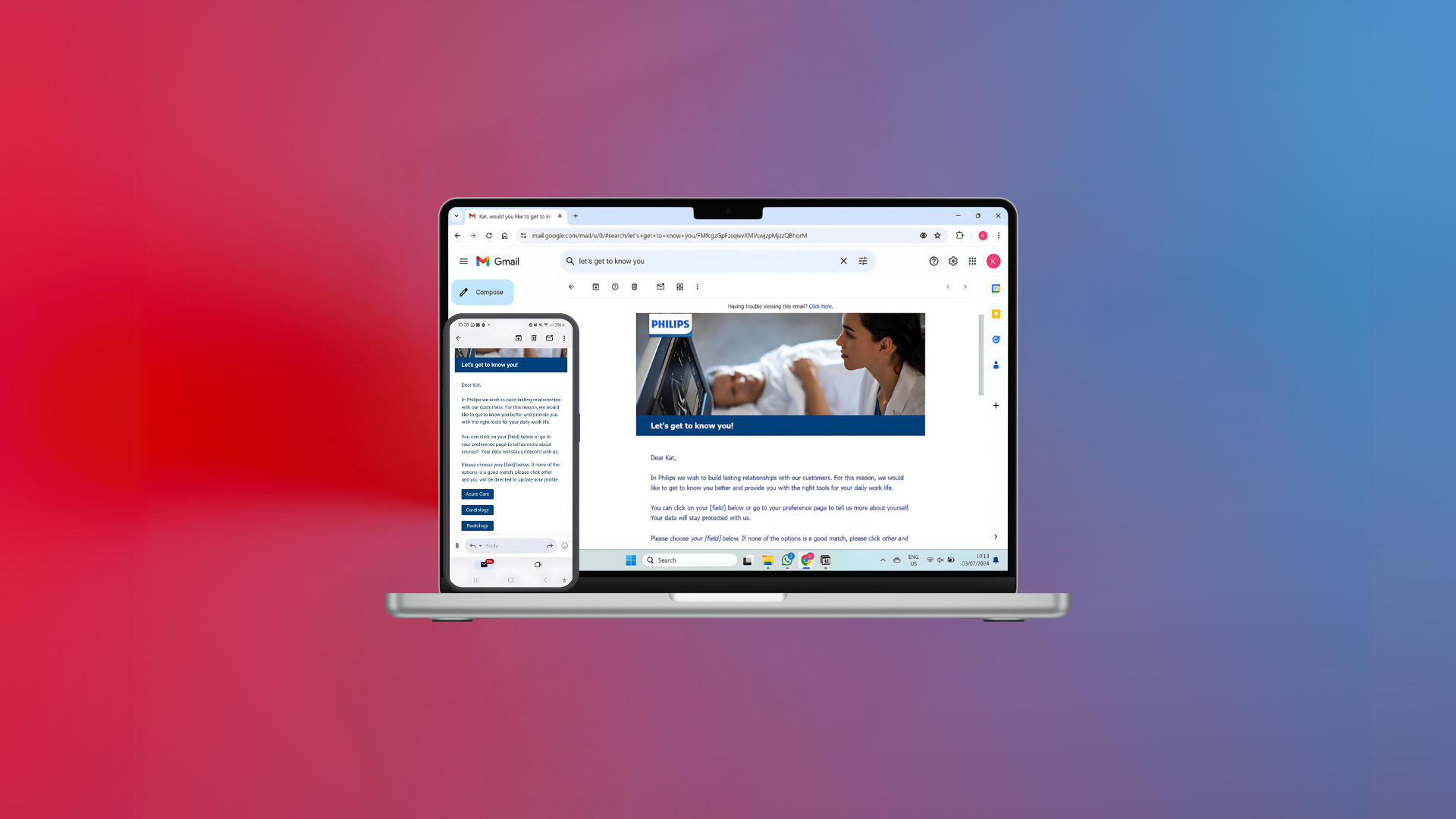
Email Alchemy: Turning Missing Contacts into Golden Opportunities for PhilipsProduct Design | Customer Journeys | Wireframes | Testing

Museum CX Overhaul: Crafting a Visitor Journey That's a MasterpieceService Design | Research | Personas | Customer Journeys
KS
Let's create together
Phone: +31628750362
Email: kath.stavrou@gmail.com
LinkedIn: @kathstavrou
© Katharina Stavrou